more favorite ad campaigns
okay, maybe this is just one. for now. this is from levi's square cut jeans in malaysia. for the record, levi's square cut jeans are my favorite jeansline ever, and probably the only jeans i can (and possibly will) buy from levi's, apart from their redloop range (which i already have a couple of pairs of in 34. never thought i'd say i'd fit into a 34 again). first of all, i'm a fat-ass person, so the low waist and wide waistband give really generously to my hips and butt. second, the details really give you that oomph, especially the "money pocket" (in place of the watch pocket) in 523 a-type jeans, which are apparently sold as "limited edition" jeans here but get replenished regularly in malaysia. third, the stitching and tailoring just makes me look thinner and better than i really look.and fourth, the washes really look natural, not stenciled like they can get in other brands. and lastly, they're priced humanely; i got my 522 slims in broken-in dark wash for just php2,250, and the 523 a-type for just php3,000. i checked diesel the other time at powerplant rockwell, and the same wash goes for over php11,000. that's just their spring-summer "new wave" range. even if it doesn't cover the others, the price is too obscene for me. (the redloop's a litle more expensive at php5,800, but it's still more humanely-priced than diesels or armani exchange jeans, which i learned, are "sensitive". now, jeans aren't supposed to be sensitivec, should it?)
i get the "sampayan" metaphor in the local levi's square cut campaign, but their website's just horrible to navigate. the "balloons" are irritating, and the upside-down models look like they're asphyxiated. at least in the malaysian campaign the website's fun to navigate.
here's a snippet of the campaign:
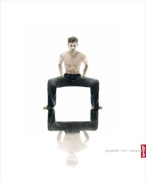
that's the malaysia one. here's the local campaign (taken from the website):

although the local campaign is, in the technical sense, better strategically and idea-wise than the malaysian campaign, the malaysian one's visual styling pretty bowled me over to their direction.
kinda makes me a little disappointed with the way advertising's going here. like, cg-to-death shampoo commercials, mongrel-breed models, young-and-struggling bands singing to the tune of a dandruff shampoo to stay afloat. is pandering the new trend in campaigns that make it past the client pitch? can good advertising just get consummated with a powerful visual, with no need for long copy with nothingness words? can we lay off the song-and-dance for a change? can we use curly-haired girls instead of rebond/plancha to death retocada mongrels for shampoo ads?
just musings from this direction. anyway, i nicked the photo from a good blog i found a while ago. check this out. really good campaigns. it'll make you pee you pants. the campaigns, i mean. ha!
xanananananana


0 Comments:
Publicar un comentario
<< Home